
 I’ve been thinking about creating a 3D model of Minard’s famous chart depicting Napoleon’s 1812 invasion of Russia for quite a while. I finally gave it a shot over the weekend.
I could not be happier with the results. The first person I showed the model to said that she never really understood what Minard’s chart was showing until she saw it in 3D.
Minard was a French civil engineer who made a chart showing Napoleon’s army’s losses during the course of his ill fated invasion of Russia in 1812.
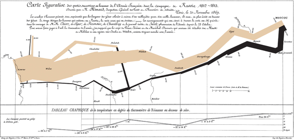
Napoleon started the campaign in June of 1812 with 442,000 men at his command. 100,000 men made it to Moscow when Napoleon was forced to retreat. Cold weather and the absence of food during the return march killed most of the rest of the army. Only about 10,000 men make it back out of Russia.
It is a well known analysis and is thought by many to be one of the best statistical charts ever made.
Here is what Minard may have made if he had had access to a 3D printer in 1869:
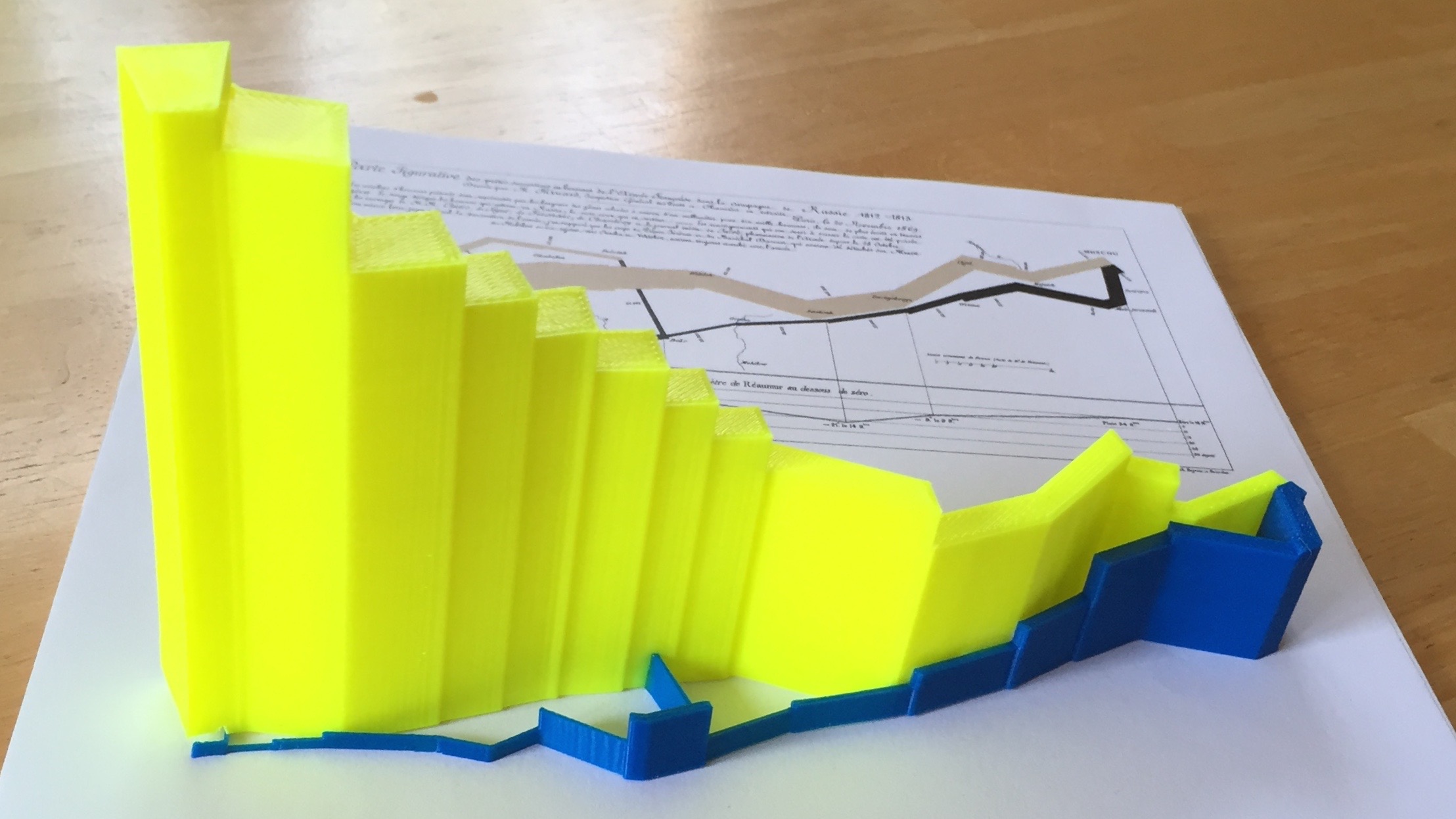
Minard encoded the number of men in the army as the width of the line connecting stages of the invasion across the map. His scale is 1 mm per 10,000 men. The 3d version double encodes this information as both the width of the lines (as in Minard’s 2d version) and as the height of each segment. I had to exaggerate the vertical elevation a bit in order to print the whole thing in one piece, but the basic message is the same: very few soldiers returned from the campaing.
To make a model at a scale more similar to Minard’s I’d need to use a larger printer, or print the model in pieces.
The model was created in OpenSCAD, using an SVG file I drafted in Inkscape. The paths were exported from Inkscape to OpenSCAD using dnewman’s Inkscape to OpenSCAD converter