11/23/15

Three days – 4,000 Years

Stolen Years

The statistics on gun violence in this country are heart breaking. Guns killed 11,419 people in 2013. This represents a loss of over 500,000 years of life. Unfortunately, the rate of gun violence continues unchecked. This topic never loses its timeliness. Three Days – 4,000 Years is an adaptation of the powerful U.S. Gun Deaths visualization the data design firm Periscopic created a few years ago in response to the school shooting in Newtown CT. Continue reading

10/30/15

Elevation map of sea surface temperature shows Gulf Stream

Here is ansnapshot00
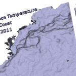
other 3D map. This one shows differences in sea surface temperature (SST) along the East Coast of the U.S. The elevation differences highlights the Gulf Stream, a surface current that flows north along the western edge of the North Atlantic, transporting warm water northward from the tropics.


Continue reading

09/1/15

Napoleon’s march in 3d

minard1xI’ve been thinking about creating a 3D model of Minard’s famous chart depicting Napoleon’s 1812 invasion of Russia for quite a while. I finally gave it a shot over the weekend.

I could not be happier with the results. The first person I showed the model to said that she never really understood what Minard’s chart was showing until she saw it in 3D. Continue reading

08/31/15

More Wave Interferences Models

DSC_0078 The wave interference models I shared a few months ago followed two dimensional waves over time. (x and z axes represented space and the y axis represented time. As an extension of this work, I’ve started creating models of interaction patterns formed by circular waves.

The models in this post are snapshots showing interaction pattern formed by two longitudinal waves propagating over time.

Continue reading

07/24/14

The challenge of using area to communicate values in visualizations

Bubble charts are a popular way to present quantitative data. Often the area of the circles in the bubble chart are used to encode the value of a parameter. The larger the value, the greater the area, the bigger the circle. This makes intuitive sense and can be quite effective for rough comparisons. However, it is important to understand that we are not very good at estimating area and  these representations distorts the data because we are not very good at estimating area.
Continue reading

06/10/13

Simultaneous brightness contrast illusion

Our eyes give us a very subjective view of the world. This subjectivity leaves us susceptible to a variety of optical illusions. The fact that we are not very good at estimating the absolute brightness of a region, but have a strong ability to detect differences between neighboring regions causes simultaneous brightness contrast illusions. This type of illusion makes the perceived brightness of any region in a complex image vary depending on the brightness of the region’s immediate surroundings.

The illustration below shows how our perception of a solid grey square is influenced by the background. The two squares below are the same shade of grey, but the lighter background behind the square on the left makes that square appear darker than the one on the right.
Continue reading